
As brands mature and they become widely recognizable, the most important representation of their identity and positioning is their logo. The logo is a visual communicator of the brand’s purpose, values, and who they are to their customers. Nike, Starbucks, and McDonald’s are a few of many brands with ever-changing logo redesigns. Current trends for customer-centric strategy are ushering in simplified and debranded logos.
Especially in early stages of development when brands are trying to increase awareness, recognition, and recall, including their name in the logo can help customers remember the brand. In the past, “Clients used to ask, ‘Can you make the logo bigger?’” 1 Advances in technology and design allowed companies to create complex logos with elements like 3-D lettering and detailed images that communicated “a brand’s modern capabilities and technological prowess.” 2

With one click, you could add filters, gradients, transparency, lighting effects, 3D rendering, complicated fonts to a graphic … We are already oversaturated with such effects and overwhelmed with too much visual information. A simple logo, then, is what cuts through all that noise and is easier to remember. With increased recognisability, a brand is better able to communicate its chosen brand message.” 3
With increased popularity for short and simplified content, “Now the trick is to shrink an entire identity into a tiny digital box,” 4 such as an app, that communicates the brand to the customer in the simplest form possible. Going back to the basics with logo design is being seen everywhere: “[M]ore and more large companies like KIA or Google refer to basic shapes and redesign their logos — which initially were quite simple and reserved. By doing so, they obtain a super concise, fresh image that won’t overcharge the customer with odd details to memorize and attach to the brand.” 5

Once brands reach a point where they are very well-known, they might try debranding. By one definition, debranding is a “strategy where a brand or corporation will typically overhaul its entire visual identity,” epitomized by their logo, in an effort to “[promote] what a brand does for its customers.” 6 As shown in the image below, British American Tobacco completely altered their brand name and image through a logo change. This allowed them to “very obviously [position] themselves as more customer-centric by removing their bland and boring corporate name, and instead outwardly displaying their (perhaps ironic) brand promise to their customers.” 7

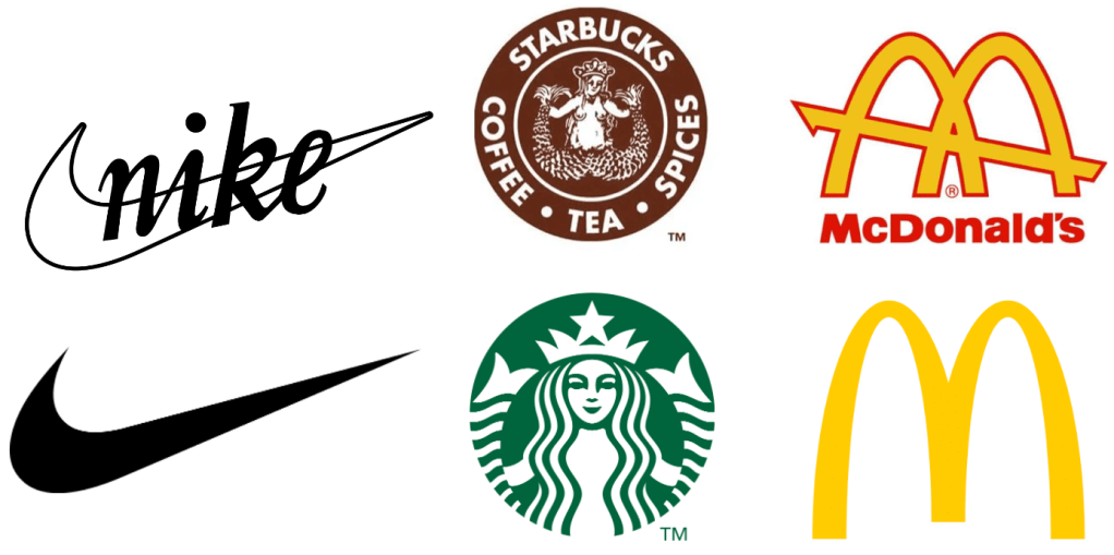
Debranding can also be defined as a strategy of “promoting your product without the logo or brand name.” 9 Nike, Starbucks, and McDonald’s are perfect examples of this tactic in practice. For many years, their logos included their brand names. As these brands became increasingly popular, the brand name dropped from the logos. This strategy is most successful with well-established brands because the Nike Swoosh, Starbucks Siren, and McDonald’s Golden Arches can be immediately recognized without the brand name next to it.
“Debranding isn’t for everyone. It requires a certain degree of existing brand equity and a deep awareness of how customers respond to a given brand or product.” 10

Debranding and simplification are popular trends in redesigning logos because of the importance for customer-focused brand messaging. By altering their logos, both well-established brands and start-ups can communicate their values and positioning to customers with on-trend designs that enhance their brand rather than overshadow it.
Questions marketing managers would ask:
- How can you communicate a brand’s positioning statement through a logo?
- What role does a logo play in the brand-customer relationship?
- At what point do you think a brand should attempt debranding its logo, if at all?
References
1 Bloomberg. (14 April 2022). Debranding is the Hip New Branding. Bloomberg L.P. https://www.bloomberg.com/news/videos/2022-04-14/debranding-is-the-new-branding-video
2 Lerh, C. (4 June 2021). Why are logos getting simpler? Story Box Collective. https://www.storyboxcollective.com/2021/06/04/why-are-logos-getting-simpler/
3 Lerh, C. (4 June 2021). Why are logos getting simpler? Story Box Collective. https://www.storyboxcollective.com/2021/06/04/why-are-logos-getting-simpler/
4 Bloomberg. (14 April 2022). Debranding is the Hip New Branding. Bloomberg L.P. https://www.bloomberg.com/news/videos/2022-04-14/debranding-is-the-new-branding-video
5 Pedchenko, K. (15 December 2021). Logo Design Trends 2022: The Future of Logos. The Designest. https://thedesignest.net/logo-design-trends-2022/
6 Somekh, D. (11 May 2021). Is Debranding the New Branding? Huddle. https://huddlecreative.com/blog/is-debranding-the-new-branding
7 Somekh, D. (11 May 2021). Is Debranding the New Branding? Huddle. https://huddlecreative.com/blog/is-debranding-the-new-branding
8 Somekh, D. (11 May 2021). Is Debranding the New Branding? Huddle. https://huddlecreative.com/blog/is-debranding-the-new-branding
9 Toygar, S. (11 May 2019). Debranding: The great name-dropping gamble. Marketing Birds. https://themarketingbirds.com/debranding-the-great-name-dropping-gamble/
10 Toygar, S. (11 May 2019). Debranding: The great name-dropping gamble. Marketing Birds. https://themarketingbirds.com/debranding-the-great-name-dropping-gamble/
